Ah, skeuomorphism. From hero to zero. Once immensely popular in the design of user interfaces, the practice of making items resemble their real-life counterparts has given way to the age of flat design. Reflections, bezels, shadows, and textures are now
old hat compared to unornamented elements, simple typography, and flat colours. Moreover, overt skeuomorphism (think older versions of the iOS app iBooks) has become the source of derision in some circles.

Skeumorphism? Gesundheit.
Before I launch into my tiny diatribe about the discourse and ways in which we think about skeumorphism and flat design, I’ll try and define the terms a little more clearly for those who might not be familiar with them. As is often the case with
language, the meaning of these terms is constantly in flux. New use of these terms brings them new meaning as they are used in changing contexts, particularly in the digital realm.
Skeuomorphism
“Skeuomorphism” was first defined as the practice of designing things in such a way as to imitate the design of a similar artefact made from another material. For instance, wood panelling on the side of certain vehicles mimics the look of
real wood. Similarly, the physical placement of intake plugs on some electric vehicles (as well as their use of hatches and flaps) apes traditional gas-based vehicles - a skeuomorphic design choice. As the term has come to be used more frequently
in digital design, it has taken on other distinct meanings. In some contexts, skeuomorphism is the practice of making things resemble their real world counterparts. To some, skeumorphism refers to design details from the past that no longer serve
a function but are important in defining the object itself. In others, skeuomorphism is the practice of making new things look older or more familiar. In others still, it’s the principle of designing things with cues that point to the real world.
However, what all these definitions share in common is the reference to an analogue in the design of an object.
Flat Design
Calling to mind the architectural and artistic trends of 1950s Modernism and the Bauhaus, “flat design” is an approach to design placing emphasis on minimal ornamentation, typography, colours, and simple elements. The use of grids and sans-serif
fonts are often found in examples of flat design as well. Perhaps one of the most well known examples of skeumorphism in contrast with flat design is the update from iOS 6 (left) to iOS 7 (right) on Apple mobile devices. Three-dimensionality and details
are dropped in favor of two-dimensionality and simplicity.

Okay, great. Skeuomorphism and flat design are different. So what’s your point?
I’m glad you asked (and not just because these fake questions make it super easy to segue from one section to the next)! The crux of my argument about skeuomorphism and flat design is this: skeuomorphic design and flat design are not opposites or
opposing ends of a dichotomy, but simply tools in a toolbox. Allow me to elaborate.
For some, the concept of skeuomorphism is solely understood to be the use of textures, reflections, and ornamentation in mimicking a real-world object. You bring up skeuomorphism and people’s minds automatically jump to overused textures, cluttered
interfaces, and something that (by the standards of current design trends) looks dated.

Image courtesy of TutsPlus
On the flip side, proponents of skeuomorphism assert that the minimalist nature of flat design is poor at communicating the meaning of elements within a given design. But skeuomorphism and flat design are not mutually exclusive, particularly when we think
about skeuomorphism in its broadest sense - the design of things with reference to analogues.
Consider the icon set below. Pretty clearly, it follows a lot of principles of flat design: little ornamentation, simple geometric shapes, and restrained use of colour (in fact, so restrained that it’s monochrome!). However, the lock, home, message,
and shopping cart icons (to name just a few) are all skeuomorphic. All four icons use the imagery of a real world analogue to communicate their meaning. Nobody uses an envelope when online messaging somebody and nobody uses an actual shopping basket
to purchase goods online but the skeuomorphic aspects of these icons communicates their meaning quickly and effectively to users.

In order to illustrate this, let’s take a look at three more examples of UI that combine aspects of skeuomorphism and flat design effectively.

First up, the humble “switch” input found on iOS devices worldwide. The simple geometric shapes and use of a two colour palette keeps the user interface clutter-free and easy to discern in the larger context of the screen while keeping in
tone with the rest of the interface. However, the slight skeuomorphic shadow surrounding the white “button” part of the input suggests to users that this is something to interact with and imbues the design with a little bit of three-dimensionality.
Further skeuomorphic elements include the visual reference to similarly designed physical switches (think of the lock switch on iPods or on/off switches on other devices) and the use (and lack) of colour to suggest “on” and “off”
states.
The digital audio workstation Fruity Loops 12 approaches its user interface in a similar way. Many similar programs attempt to recreate their real-life counterparts in an effort towards overt skeuomorphism. In comparison, the user interface of Fruity
Loops takes a more restrained approach. The design eschews textures and detailing like screws and tape but keeps familiar inputs like sliders and dials whose functionality mirrors their real-life analogue. The resulting interface is clean and uncluttered
but still semantically clear.
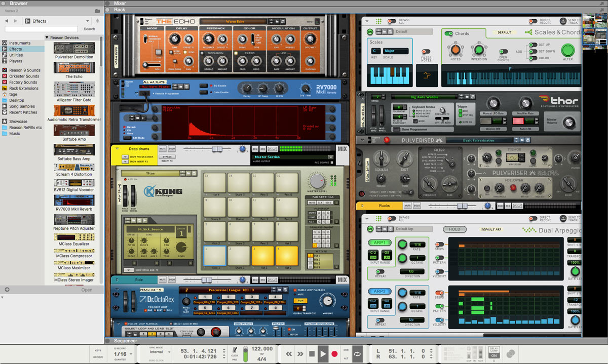
Reason 9.5 - Image courtesy of Propellerheads

Fruity Loops 12 - Image courtesy of Image Line
Games like 1-2 Switch are helping us think about skeuomorphism in new and interesting ways. Using motion-based controls, much of the gameplay of 1-2 Switch focuses on reinterpreting real-world tasks as multiplayer games. For instance, one of the included
mini-games tests how quickly you can fill a cup with milk from an udder by making players replicate milking a cow with their controller in hand. Another has players engage in a wild-west style quickdraw with their controllers. The two screenshots
below show mini-games where players have to unlock a safe and eat a sandwich (these are separate games - although one that combines both sounds fairly intense).

Image courtesy of WWG

Image courtesy of arcadegirl64/Emily Rogers
1-2 Switch contrasts flat design with skeuomorphism very starkly in its UI. Traditional aspects of a player’s heads-up display (like the “successful tries” indicators for the safe-unlocking game, and the timer for both) are presented
in a style that calls upon flat design but the interactable elements (the safe and the sandwich) are heavily skeuomorphic. Moreover, the input for the games themselves has you either rotating the controller (as a dial for the lock) or manically
nibbling at the end of the controller. These inputs mimic real life actions not only for show, they’re actually a big part of the appeal of the gameplay too. Skeuomorphism as it pertains to gestures is something that will only become increasingly
important with the rise of virtual and augmented reality.
All of these examples use skeuomorphism and flat design thoughtfully and prove that they do not need to be thought of as opposites (nor should they be).
If skeuomorphic design and flat design are just tools, then where’s the instruction manual?
In my opinion there are no hard and fast rules when it comes to design (and if there’s an instruction manual, I haven’t found it). However, stepping back and approaching your problem from a wider perspective can often be useful when faced
with design challenges. Whenever faced with a design problem, I often focus on the fundamentals of design thinking (at multiple points in the process, not just at the beginning) in order to bring into picture what is truly important. Consider
the following questions:
What is the purpose of the designed object? What problem is it trying to solve? What is the design attempting to communicate to the user?
How will users use the designed element? What will users try to do with it? How will users interpret it?
From here, it becomes easier to consider how traits of skeuomorphism or flat design (either in combination or apart) might affect your designed object. Moreover, keeping these questions constantly in mind helps to keep the big picture in perspective
and forces you to keep what’s important at the forefront.
Skeuomorphism and flat design are simply two ways of approaching design and by no means are they mutually exclusive. Thinking about the two as competing ideologies is inherently restrictive whereas thinking about the two as tools within a larger toolbox
allows for greater space for creative problem solving.
Author: Mia Ellis-Lee
Web Developer