Previously on "Ordering Off Menu", we looked at four sites that implement creative navigation solutions, and do it right! In this entry, we finish off our countdown with three more sites that use navigation that steps off the beaten path.

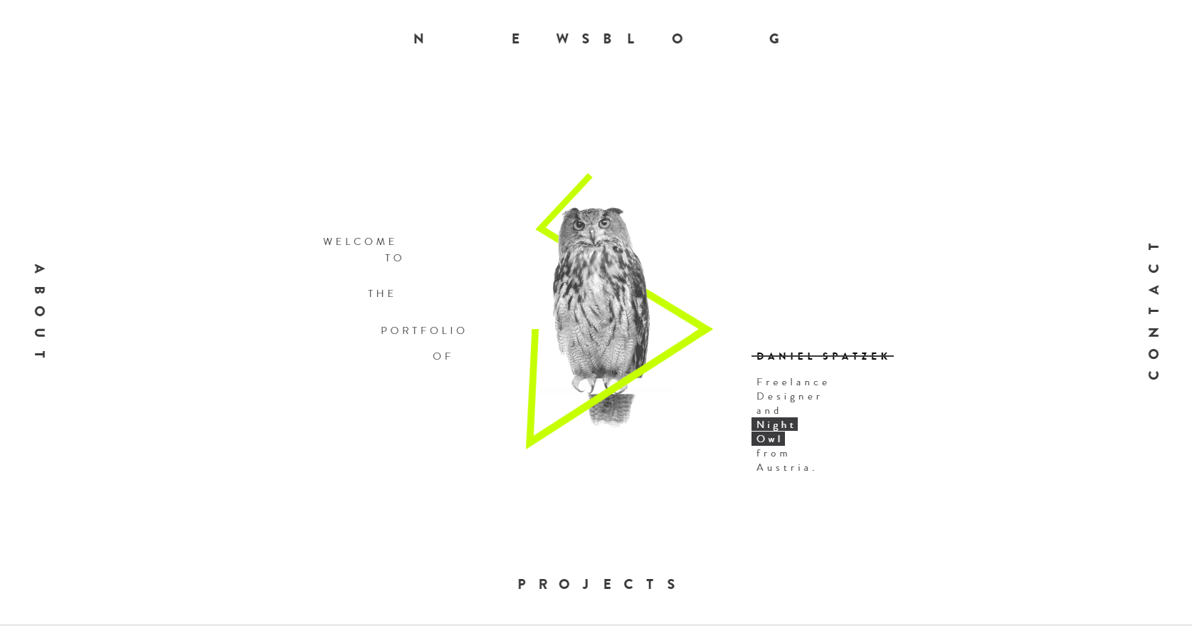
Ah yes, another portfolio site with some great navigation. This one comes from Austrian designer and developer Daniel Spatzek. Laying out the navigation in a frame-like fashion combined with the directionally-specific page transitions help to give the
user a sense that new pages (or the frame itself) are/is actually sliding from the right, left, top or bottom. The structure of the site becomes quickly apparent to users and navigating through it becomes intuitive. Of course, the issue with this
style of navigation is that it can be poorly suited to larger sites, as binding navigation to such a strong idea of physical space can quickly become complicated if used in more than four directions. Moreover, this kind of navigation can also be less
efficient when it comes to navigating through sub-pages. For instance, on Spatzek’s site, to navigate to the “About” page after being on the “Contact” page requires users to step back to the “Home” page, rather
than being able to access the “About” page directly. However, Spatzek minimizes any frustration through his excellent animations, quick load times, and concise site architecture. It never feels like a chore navigating through his site,
even though it easily could.
Of all the sites featured in this article, it is perhaps Spatzek’s whose navigation works most with the user’s sense of delight. Even stepping through his list of project brings a smile to my face as dashes indicating your page position tilt,
shift up and down, and reveal numeric indicators. Navigating through his site is truly a joy thanks to his complex, well-synchronized animations and clean design.


Revelator's Contextual Navigation Bar

Revelator's 'Dial' Navigation Menu
Revelator.com is a great example of a relatively large site managing navigation intelligently. There might be less “wow” factor than others on this list but the navigation structure is clever, visually appealing, and nicely animated
(the smooth transitions between changing pages are also gorgeous).
Revelator.com uses a couple widely used styles of navigation in interesting ways on their site. It uses both a horizontal navigation bar at the top of the page, a fixed mega-menu beneath a hamburger icon on the left of the screen, and the same
mega-menu in the footer of the page. The site cleverly uses the top navigation bar as a contextual menu - this menu shows the child pages of the current page you’re on. When you’re at the home page of revelator.com, the navigation
bar links to 'Platform', 'Solutions', and 'Company'. If you were to navigate to 'Company' for instance, the navigation items smoothly change to show you links to 'About', 'News', and 'Contact'. These
items allow you to swiftly jump to contextually appropriate sub-pages, but the mega-menus to the left and on the footer of the page ensure that it’s never difficult to navigate to a separate section of the site. The top navigation menu
also features a back button, so users unaware of the mega-menu on the left are given another navigation option when at the top of any page.
The menus are also redesigned to work more effectively on mobile as well. The mega-menu on the left is moved to the top (but still stays fixed to the screen) and features links to just the “Platform” “Solutions”, “Company”
pages and their social media accounts. Paring down the menu from all the links on the site to seven works to reduce clutter for smaller screens, but used in conjunction with the contextually changing navigation menu at the top means that users
can still easily access pages on a lower level of navigation. The mega-menu at the footer remains as well, so users are presented with another navigation menu after scrolling through a page. Navigating to their solutions page [stale, broken link removed] also
reveals a cool rolodex-inspired menu for users to select “Solutions” by their industry. This menu is featured on both desktop and mobile - but is far more satisfying on mobile devices. Flicking the dial on a touch screen to scroll
through options is infinitely more gratifying than clicking an option (and unfortunately it doesn’t support clicking, holding, and flicking your mouse up/down).

Subaru really knocked the navigation out of the park with this page tucked away in the “Corporate Responsibility” section of their
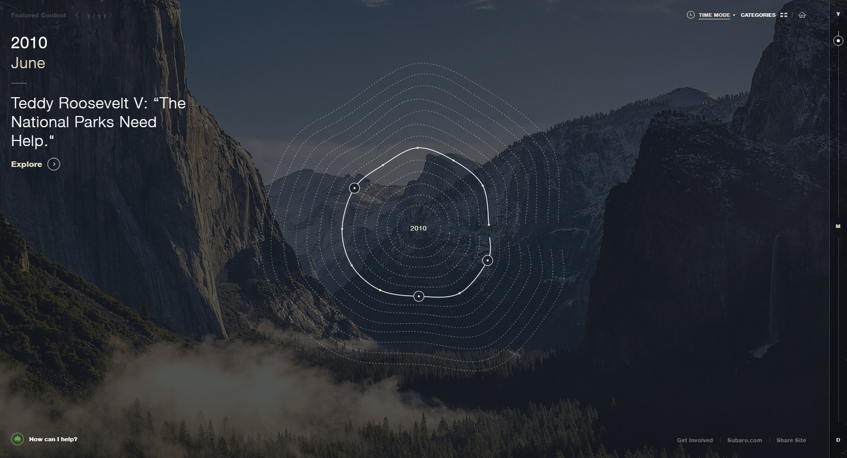
website. The page (when on the default setting of “Time Mode”) functions as a timeline of Subaru’s efforts towards sustainable and environmentally friendly practices. Users can scale the timeline between years, months
and days. The page initially loads at the widest end of the scale “years”. At this end of the scale, the timeline is represented as rings in a tree. Narrowing down into “months” or “days” causes
the timeline to fold out into a linear line representing the selected year (these animations are gorgeous). The “months” view has you progress through a selected year by months, and the “days” view has you progress
through a selected month by days. In any of these views, small circles indicate clickable nodes that show videos and other content that illustrate environmentally-friendly events in Subaru’s history. You can also browse through
the content by a list of categories should users focus on accessing the content as quickly as possible.
Experiencing the navigation of this site yourself is truly valuable - in practice this complex-sounding navigation system is incredibly intuitive. The “Time Mode” style of navigation, is where the page truly shines. Other sites
have integrated content and navigation cleverly as well, but in this case, navigation also helps recontextualize and illuminate the content by emphasizing the chronology between the content nodes. The navigation serves not only as
navigation, but also as an effective communication tool for the content.
Author: Mia Ellis-Lee
Web Developer