When we think about UI and UX, looking to other mediums can be a great source of inspiration. Video games, because of their interactive nature and need to communicate vital information back to the user, make for an interesting topic. The methods that
video games communicate this information varies across titles, genres, and even platforms - today we’ll take a look at two examples of diegetic user interfaces in video games and see what insights we can pull out as we compare and contrast these
two approaches.
The two games that we’ll be comparing today are Dead Space (2008) and Resident Evil 6 (2012). Both games are third-person shooters with a survival-horror slant. Since they fit within similar genres, they make for a natural point of comparison as
the information that the games need to communicate to the user is fairly similar (for comparison, an MMORPG like World of Warcraft needs to communicate a much wider array of information to the user).
Both games approach showing the necessary information to the user in a diegetic fashion. What this means is that the game’s UI exists in line with the story of the world and exists within the world of the game. For example, in the case of Dead Space,
the amount of ammunition in a gun is not shown through an abstract floating counter disconnected from the game environment, but is actually shown as a projection from the gun itself. In the case of Resident Evil 6, similar information is shown through
the character’s phone (referred to in-game as a “COMs device”).
Dead Space has received well-deserved praise for its thoughtful and innovative approach to showing this information, but to better understand why Dead Space works so well, we need to compare it to a game that takes a similar, but less effective approach.
Why does Dead Space work well, and why doesn’t Resident Evil 6?
So, why is Dead Space so effective - how does it compare to Resident Evil 6’s approach? There a few key areas that make the UI differences between Dead Space and Resident Evil 6 clear.
Obtrusive versus minimal
One of the great things about Dead Space presenting information is how clean and minimal their approach is. They communicate what they need to in an unobtrusive way. In comparison, Resident Evil 6’s diegetic UI is large and distracting
- it takes up the entire bottom corner of the screen and detracts from the atmosphere, environment, and overall tone of the game. It feels a little akin to being in a theater and somebody keeps texting during the movie.
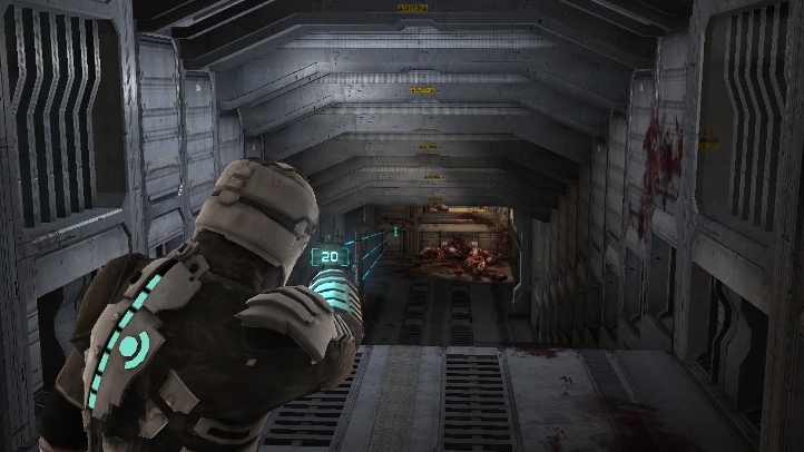
Dead Space’s UI is presented within the environment
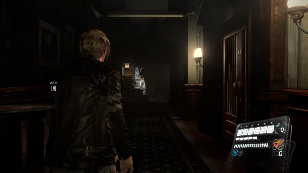 Resident Evil 6’s UI takes up a large portion of the bottom right of the screen
Consistency and clarity
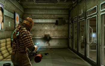
Dead Space adheres to a strategy of clarity - UI elements are consistently the same colour, and appear in a similar manner across weapons and exo-suits (the player character’s armour that can be upgraded throughout the game). In Resident
Evil though, the appearance of the COMs device varies between characters - each one having their own model. While the information is laid out in a similar fashion between devices, I would argue that the lack of consistency doesn’t help the
player at all (taking a second to mentally register the UI can make the difference between life and death when a zombie is clawing at your face). It seems like the rationale for this choice is to make the characters feel more distinctive. I would
respond that if you’re relying on the appearance of a phone to make characters feel distinctive, you probably need to have a second thought about gameplay and narrative.
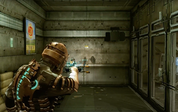
Ammo counters in Dead Space are consistent across weapons (211-V Plasma Cutter on the left, PFM-100 Hydrogen Torch Flamethrower on the right)
Health indicators in Dead Space are consistent across exo-suits (Standard Engineer RIG on the left, Standard Astronaut RIG on the right)
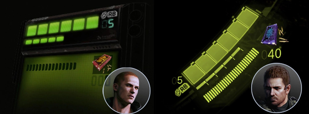 COMs Devices in Resident Evil 6 differ between characters (Jake Muller’s COMs device on the left, Chris Redfield’s COMs device on the right)
Integration with gameplay
Perhaps my biggest issue with Resident Evil’s approach is its ineffectiveness (by comparison) with integrating into the action on-screen. As previously mentioned, the HUD (heads-up display) in Resident Evil 6 is obtrusive. However, not only is it
obtrusive, but it is actively distracting as it forces users to take their eyes away from whatever is in front of their player character and instead forces them to glance away to the bottom right. The straightforward, logical approach that Dead
Space takes has the off-shoot effect of placing the HUD elements in a way that integrates seamlessly with gameplay. You’re shooting a gun, looking down the barrel, and the ammo count is displayed directly in front of you. Your character
gets attacked, you can see his health decrease on his body.
Dead Space UI elements are integrated into their gameplay objects, Resident Evil 6 UI elements are separated
*** DISCLAIMER! The footage below is from games that have been rated as “Mature” by the Entertainment Software Rating Board.
This content is generally suitable for ages 17 and up and may contain intense violence, blood and gore, sexual content and/or strong language. ***
What did we learn?
So, what can we take away from this examination? I think a few design lessons ring true:
Video Credits
If you’re curious to see these games in action, you can view gameplay footage at the following links:
Image Credits