Our design team was challenged to come up with home screen widgets for existing apps to see how these types of interfaces could help improve the overall user experience for these apps.
Our designers Mia and Andrew both selected a real-world application and designed concepts for each of their respective iOS homescreen widgets.
We’ll be joining them in a conversation about their designs and different approaches they took to come up with their concepts.
Andrew:
Hi Mia! Why don’t we start with your designs? Can you please give us a bit of an overview of the app you chose and why you chose it?
Mia: Hi Andrew! Absolutely, I chose to design a couple scoreboard widgets for the NHL app. The official NHL app doesn’t offer any homescreen widgets, and I find that alternatives like The Score don’t show the amount of details
that I ideally would want to see in a scoreboard widget. So it seemed like a good opportunity to create a widget for something that I’m passionate about.
Andrew: How did you decide what to emphasize in your designs?
Mia: Since the NHL app doesn’t have homescreen widgets, I started my concept by taking a look at homescreen widgets from The Score. The biggest problem I have with The Score’s scoreboard widgets is a lack of information -
across sports, they only show the score of a game with no ancillary information. When I want to quickly check in on a game, the score is obviously the most important detail, but I also want to see the cadence of the game and who is performing well.
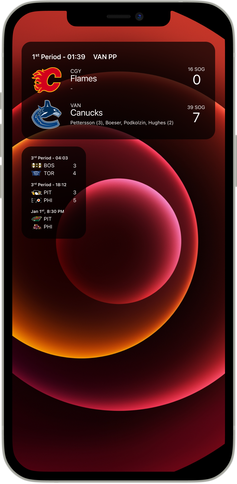
Since I’m designing a widget for the NHL, that allowed me to focus in on hockey and the metrics that indicate how a game is progressing. I took inspiration from sources like broadcast scoreboards and jumbotrons while also using my own knowledge
of the sport to hone in on some key statistics to show in the scoreboard: time left in the period, who (if anyone) is on the powerplay, shots on goal, and who has scored. A slightly hidden piece of information is who is playing at home - the home
team is commonly indicated in hockey as the bottom team on the scoreboard (since games are often described as [Away Team] @ [Home Team]).
Instead of just getting the score of the game, my widget solution leverages the empty space to convey a bit more context of how the game is actually going (since scores do not always indicate how well a team is playing).
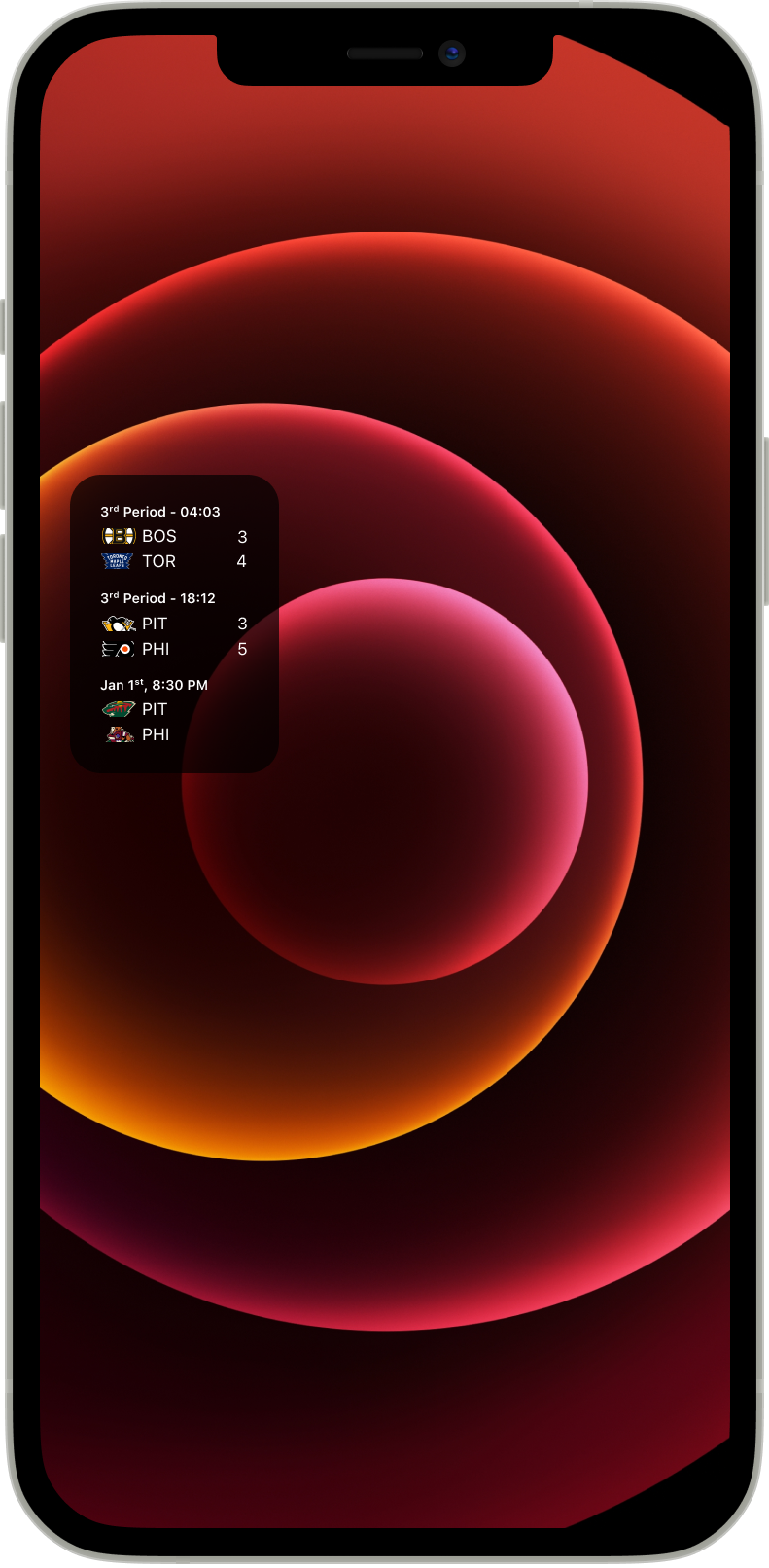
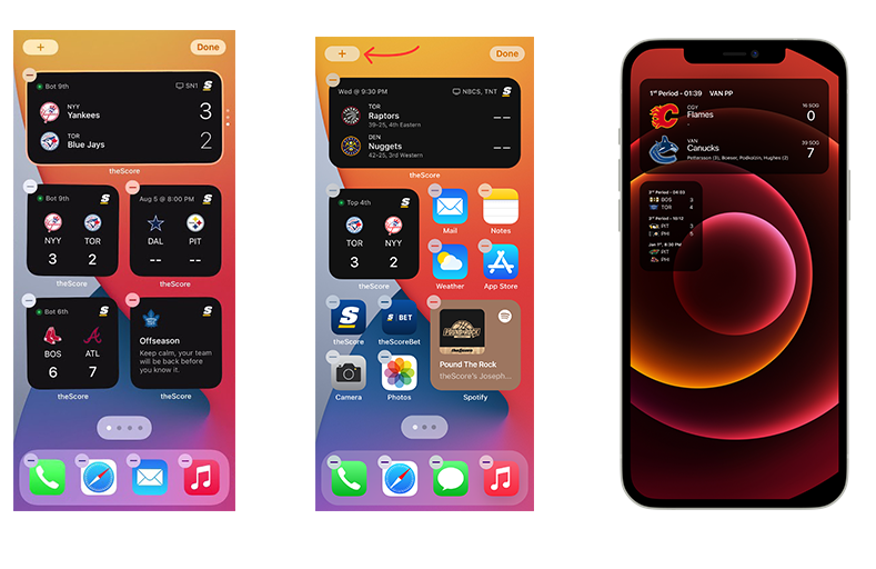
I also designed a second widget for showing multiple games in a single, small format scoreboard. I didn’t love that The Score’s approach to showing multiple games was just having multiple widgets, so I tried to show three games inside of a single widget. The NHL app allows users to favourite teams, so the concept here is that this widget would show the next three most recent games for your favourite teams. If you don’t have any teams favourited, it would simply show the next three most recent games of all NHL games that are being played that day.
Andrew: That looks amazing and is extremely well thought out. I really appreciate how you leverage your personal passion for the sport to inspire your design. Adding the correct metrics that provide context to the game instead of
just checking a “static” scoreline is a great touch that adds a “dynamic” feel to the numbers. What challenges did you come across while designing?
Mia: I personally, don’t use an iPhone and I’ve used Android for a long time, so designing for an iOS environment was a bit novel for me. I tried to adhere to the Apple iOS typography guideline as much as possible
to keep the home widgets feeling as native as possible.
As well, with the multi-game widget, it was a challenge to figure out how best to display logos while keeping the format of the widget small. Logos are typically square, so showing the full logo either resulted in throwing off the balance of the
white space and making the widget too large, or would result in the logos being too small to see any real detail. The solution I had here was to use a masking strategy, where the logo appears only in a landscape-oriented rectangle. Any parts
of the logo above or below get cut off. This worked well because it still preserves the identifying features of the logo while still retaining space. However, consideration is that the logos couldn’t be consistently cropped from the
middle - logos like the Penguins had to be cropped from the top to preserve the identifying feature (the middle crop resulted in the Penguin’s head getting cut off).
Andrew: Designing for a device you’re not used to is definitely an interesting challenge but you did a great job! I also like the solution you came up with for the logos. It creates consistency for your layout while still
retaining the recognition factor that fans would have for their favourite (or least favourite) teams. If you were to take this project a step further, what would you want to do?
Mia: Thanks Andrew. I’d probably want to do some additional widgets for stat leaders for your favourite team, recent news stories from around the league - things to help flesh out the set and allow users to have a more fulsome
homepage widget experience.
I’m curious to hear what you’ve come up with for your challenge! What did you choose and why?
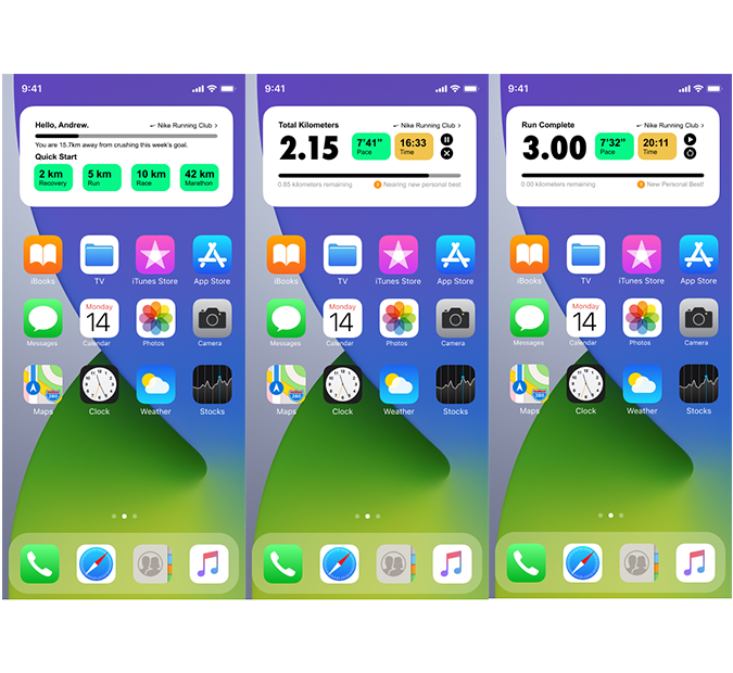
Andrew: I chose the Nike Running Club app. I started running over the summer and it was a great app I downloaded to track my progress and statistics over the past few months. It has some great features and an enjoyable experience
that encourages me to run more but I’ve definitely noticed a few pain points as a regular user that I thought would be fun to address.
Mia: Very cool choice! How did your personal experiences running with the app inform your design?
Andrew: Overall, I’ve really enjoyed my experience with the app and I recommend it to all my friends who run so that we can share our progress with each other. However, the app is definitely not perfect and I’ve
had my own frustrations with it. When we started this challenge, I started to note down my experiences over the course of a few weeks to really pinpoint how I could improve the experience.
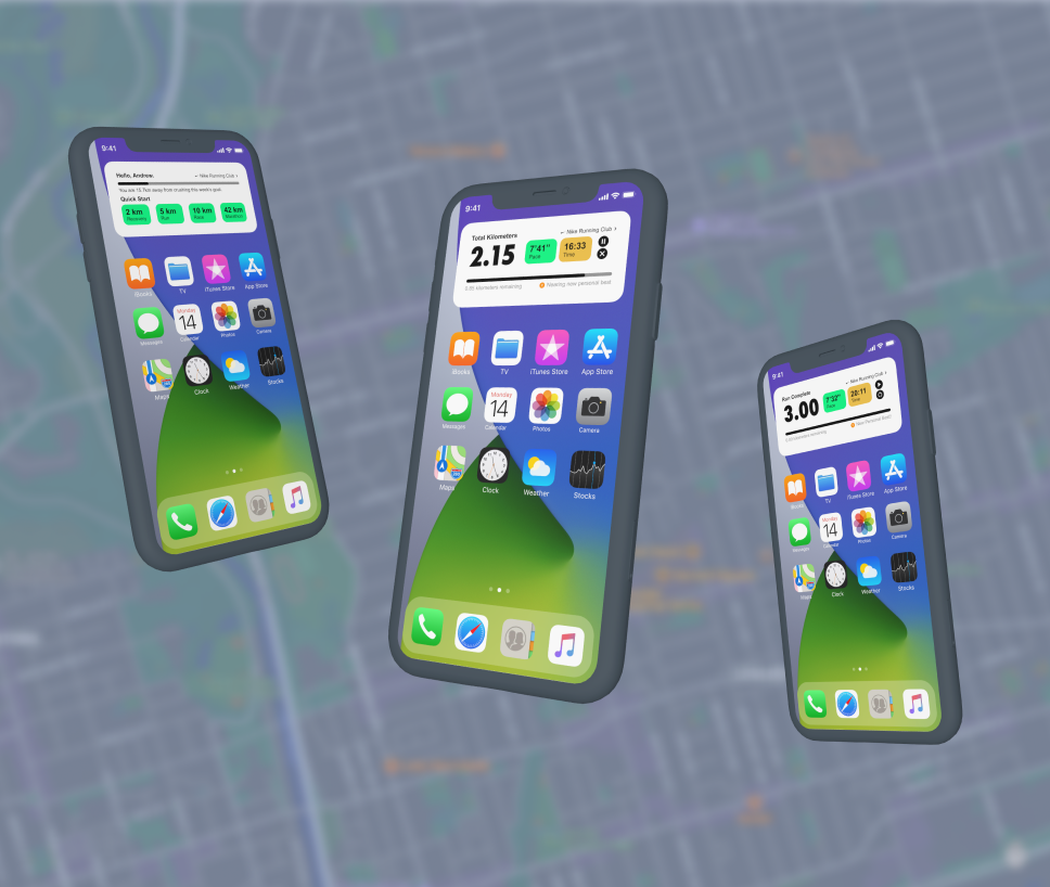
My first observation was that it was a bit difficult to check your run progress or configure your run on the fly during a run. I found myself wishing that the app had a widget that lived on the home screen or lock screen since I would often be
struggling to unlock my phone and re-open the app while on the move. Currently, it only has widgets for past runs and quick starting runs.
My second observation was that the app relies on audio cues and prompts to update the runner on progress and statistics like pace and distance remaining in the run. While it is a good method of communicating that information, it may be an accessibility
issue for users with hearing problems or even users who simply don’t want to run with earbuds or headphones.
Lastly, I experienced a few runs where I was just a few seconds off a personal best. Had I known, I would have pushed myself through the last bit of my run but I would often only find out after I had finished and stopped the run. While chasing
times isn’t everything in running, it definitely would be nice to know when you’re approaching a new personal best time.
Mia: Those are some pretty important pain points to address. Being able to check your performance quickly would definitely make me more likely to want to use the app. Anything that stuck out to you as particularly challenging
in the process of designing these?
Andrew: Capturing and displaying all the necessary information in a smaller space while being digestible at a glance. One of the scenarios I envisioned when designing was “What would this look like to somewhile while
shaking and bouncing?” since that would be the typical runner’s point of view. I tried to provide multiple ways to convey the same information when possible such as a status bar and small text to communicate run progress/distance
run or using colours and numbers to convey average pace and time. It was also tough to add a bit of character and encouragement into the design because while it’s important to efficiently convey information to an exhausted runner, something
stale and boring definitely won’t help.
Mia: What would you want to do for enhancements or next phases of the project?
Andrew: In an earlier version, I had a line of motivation in the widget that provided some motivating text or an inspiring quote that changed from time to time. In some of the games I play in my free time, I always see fun
facts and funny little blurbs in loading screens that bring a lot of character to an otherwise boring screen. Simple things like a quote or some funny text could bring encouragement to people who might need that extra little
push to finish their run. If I had more time, I’d definitely work that into my design
Mia: Thanks Andrew! To wrap things up, there are a lot of design approaches that we can take away from this exercise and apply them across a range of digital products or interfaces - in particular design legibility, streamlining
of information, and considering the end-user use cases. As well, it was an interesting process to work within such strong constraints. Designing within bounds can actually unlock creativity as you try and work within a set of parameters and
problem solve within those boundaries. It was a lot of fun to work through this and chat about what we came up with!